Data


Which option best structured describes data?
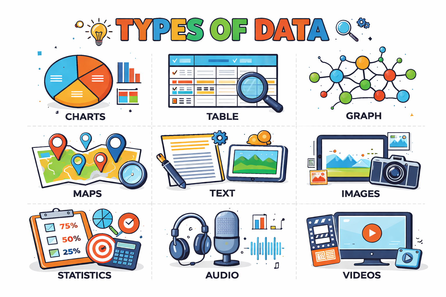

Data labeling is the process of adding meaningful tags, categories, or annotations to raw data so it can be used to train, evaluate, and improve machine-learning systems. In practice, labeling turns unstructured inputs into examples a model can learn from: each data item (an email, an image, a call recording) is paired with a target label that represents the “correct” answer the model should predict. Labels can come from several sources. Many labels are created by people—for example, tagging an email as “spam” or “not spam,” marking a product review as “positive,” “neutral,” or “negative,” selecting intent categories for chatbot messages, or identifying entities like PERSON and LOCATION in text. Labels can also be generated from rules or heuristics, such as labeling sessions as “high risk” when certain thresholds are met (e.g., too many failed logins, unusual spending patterns). This is useful when expert definitions can be translated into measurable criteria, though the resulting labels may inherit the limitations or biases of the rule. A common modern approach is assisted labeling, where tools help humans work faster—such as model-suggested labels that annotators confirm or correct, active learning that prioritizes uncertain examples, or pre-labeling that humans review. These semi-automated workflows can reduce cost and speed up iteration while keeping humans in the loop for accountability and edge cases. Regardless of the source, labels should reflect a clearly defined concept so that different annotators would apply them in the same way. This usually requires a written label schema and guidelines that specify: what each label means, what does not count, how to handle borderline cases, and what to do when information is missing. Accurate, consistent labels create a reliable foundation for both model training and evaluation; noisy or inconsistent labels can cap performance and make metrics misleading. Labeling applies to many data types and tasks: • Images: drawing bounding boxes around objects (car, pedestrian), outlining shapes for segmentation (road, sidewalk), keypoints (pose estimation), or adding scene-level tags (indoor/outdoor). • Text: document or sentence classification (topic, sentiment, toxicity), named-entity recognition (PERSON, ORG), relation extraction, summarization quality ratings, or token-level labeling. • Audio: transcriptions, time-stamped speaker labels (speaker diarization), emotion tags, or event detection (gunshot, siren). • Video: action recognition labels, object tracking across frames, or temporal segments for events. • Tabular data: outcomes such as “defaulted” vs. “paid,” “churned” vs. “retained,” fraud/non-fraud, or next-best-action responses. High-quality labeling also involves managing common challenges. Ambiguity in definitions can cause disagreement; class imbalance can lead to too few examples of rare but important cases; and inconsistent annotator behavior can introduce systematic noise. Quality control often includes annotator training, calibration rounds, spot checks, inter-annotator agreement tracking, gold-standard examples, adjudication for disagreements, and iterative updates to guidelines as new edge cases appear. When labeling is done carefully—using clear definitions, representative data, and robust review—raw data becomes a structured training signal that enables reliable predictions and better downstream decisions.
- Better decisions: evidence-based choices instead of guesses.
- Efficiency: identifying bottlenecks, waste, and patterns.
- Accountability: tracking outcomes over time.
- Discovery: revealing trends and relationships you might not notice otherwise.
- Prediction: forecasting demand, risk, performance, or behavior.
- Data: raw values (e.g., "23, 25, 22" temperatures).
- Information: processed/organized data with meaning (e.g., "average temperature is 23.3°C").
- Knowledge: insights used to act (e.g., "schedule maintenance because higher temperatures correlate with failures").
- Structured: organized in rows/columns with a fixed schema (spreadsheets, relational databases).
- Semi-structured: has tags/keys but flexible shape (JSON, XML, log files).
- Unstructured: free-form content (text documents, images, audio, video).
- Quantitative (numeric): counts, measurements, prices, time durations.
- Qualitative (categorical): labels and categories (colors, brands, customer segments).
- Nominal: categories without order (blood type, product ID).
- Ordinal: ordered categories (rating 1–5, education level).
- Interval: numeric with meaningful differences but no true zero (temperature °C).
- Ratio: numeric with a true zero (weight, distance, revenue).
- Human-generated: surveys, interviews, forms, social media posts.
- Machine-generated: sensors, IoT devices, application logs, GPS.
- Business processes: sales transactions, inventory records, HR systems.
- Public sources: government datasets, research repositories, open data portals.
High-quality data is more reliable for analysis and decision-making. Poor quality can produce misleading conclusions, even with sophisticated tools.
- Accuracy: values correctly represent reality.
- Completeness: required fields are present.
- Consistency: no contradictions across sources or records.
- Timeliness: up to date for the intended use.
- Validity: values follow allowed formats/ranges (e.g., dates are real dates).
- Uniqueness: duplicate records are minimized or resolved.
- Collect: gather from sources (forms, sensors, APIs).
- Store: save in files, databases, or data warehouses/lakes.
- Clean: fix missing values, duplicates, outliers, and formatting issues.
- Explore: summarize and visualize to understand patterns.
- Analyze/Model: apply statistics, machine learning, or other methods.
- Communicate: share insights with charts, reports, dashboards, narratives.
- Act & Monitor: implement decisions and track outcomes; iterate.
- Center: mean, median, mode.
- Spread: range, variance, standard deviation, interquartile range (IQR).
- Shape: skewness (left/right), modality (one peak vs multiple peaks).
- Bar chart: compare categories.
- Line chart: trends over time.
- Histogram: distribution of numeric values.
- Box plot: spread and outliers across groups.
- Scatter plot: relationship between two numeric variables.
Consider a small dataset of online orders. Each row is an order; each column is a variable describing that order.
order_id,customer_segment,order_total,items_count,order_date
1001,New,39.99,2,2026-05-10
1002,Returning,120.50,5,2026-05-10
1003,New,15.00,1,2026-05-11
1004,Returning,75.25,3,2026-05-11From this, you can compute summaries (average order_total), compare groups (New vs Returning), or track trends over dates.
- Privacy: collect only what you need; protect sensitive data (e.g., names, addresses, health info).
- Consent and transparency: explain how data will be used.
- Security: control access, encrypt where appropriate, monitor for breaches.
- Bias and fairness: data may reflect historical or sampling bias; evaluate impacts on different groups.
- Accountability: document sources, assumptions, and limitations.
- Variable/feature: a column (e.g., order_total).
- Observation/record: a row (e.g., one order).
- Dataset: a collection of related records.
- Population vs sample: all items of interest vs a subset used for analysis.
- Missing data: values that are absent (null/blank).
- Outlier: an unusually large or small value compared to others.
A temperature measured in Celsius is typically which measurement scale?
Which data quality dimension is most directly concerned with duplicate records?
Data is the raw input for analysis and decision-making. Understanding data types, sources, quality, and the lifecycle from collection to action helps you work more effectively and responsibly. With good practices—cleaning, exploring, analyzing, and communicating clearly—you can turn raw data into insights that matter.